The next time you log into your company’s Facebook Page, you’ll probably notice something different – well, a few different things. The social media networking giant has revamped its Pages, focusing on a cleaner and more coherent design to emphasize the respective brand.
As you may already know, Facebook Pages are designed for companies, businesses, organizations, nonprofits, musicians and artists. They differ from profiles in the sense that users can “like” them. Furthermore, Facebook Pages are used for commercial purposes, whereas profiles cannot be used for commercial purposes.
The Changes
So, what kind of changes did Facebook make to its Pages? Well, it features most of the same elements as the previous Page layout, only now it’s rearranged differently, presumably to emphasize the brand. Profile pictures, for instance, are now displayed at the top left of the Page, directly about a new vertical navigation sidebar with links like Home, About, Email, Twitter, Likes, Posts, etc. Previously, profile pictures were displayed over the Page’s cover image, which was a common complaint among many users. It appears that Facebook has heeded the advice of the community, as profile pics are now displayed in the corner without covering up any of the Page’s cover image.

New Call-To-Action Button
You’ll also notice a new call-to-action button. Found directly below the Page’s cover photo, this CTA can be used to generate email signups, sell products, visit website, download an app and more. Granted, the previous Facebook Page layout also supported CTAs, but this new design features a default CTA directly under the the Page’s cover photo.
And a final change: Facebook Pages will no longer display ads. In the past, Facebook Ads would display on the right side of Pages. The social media giant has since opted away from advertising on desktop Pages, however, eliminating them from its new design.
As explained by Facebook, this new Page design is intended to optimize user experience by including a new column for navigation and a more prominent CTA button.
“We’ve introduced a new design for Pages on desktop to make it easier for people to learn about and interact with businesses on Facebook, including a new column for tab navigation and a more prominent call-to-action button,” said a spokesperson for Facebook.
Being that Facebook just rolled out the new layout less than a week ago, it’s still too early to determine how exactly it will affect brands and their visibility on the social media network. With that said, it’s safe to assume the new changes will have a positive effect, as Facebook likely conducted their own internal tests before making the changes live.
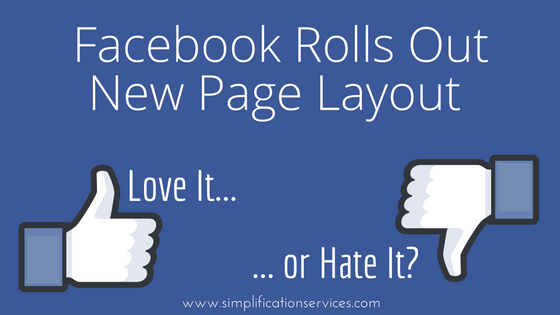
What do you think of the new Facebook Page layout? Love it or hate it?
Leave a Reply